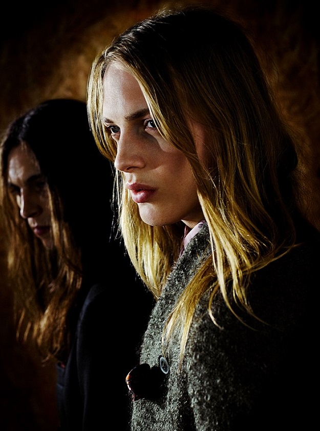
Paul Smith AW2013 ad campaign the mood has changed to something richer, darker and moodier after the brightness and paunchiness of SS2012. In mens, heavy overcoats and colourful
geometric graphic knits are featured, showing the diversity of the 2013
Collection. Some of the women’s outfits feature
images of Paul’s architectural photography, beautifully woven into the fabrics. The set mirrors some of the more basic
elements that featured in the Men’s Autumn Winter Fashion Show from January in
Paris.
Rough chipboard wall, fashioned out of recycled wood give a raw edge to the imagery. Copper sheeting was used to floor the set, but also to help create a warm glow to the mood of the images. Strong, directional lighting, favoured by Paul in his photographic work, is again utilized, allowing the viewer to connect with the model and engage in direct eye-to-eye contact. Moody, rich, dark and dramatic are in for AW2013.


No comments:
Post a Comment